ServicesCase StudiesAboutBlogContact+1 646 741 1848

Design Systems & Component Libraries

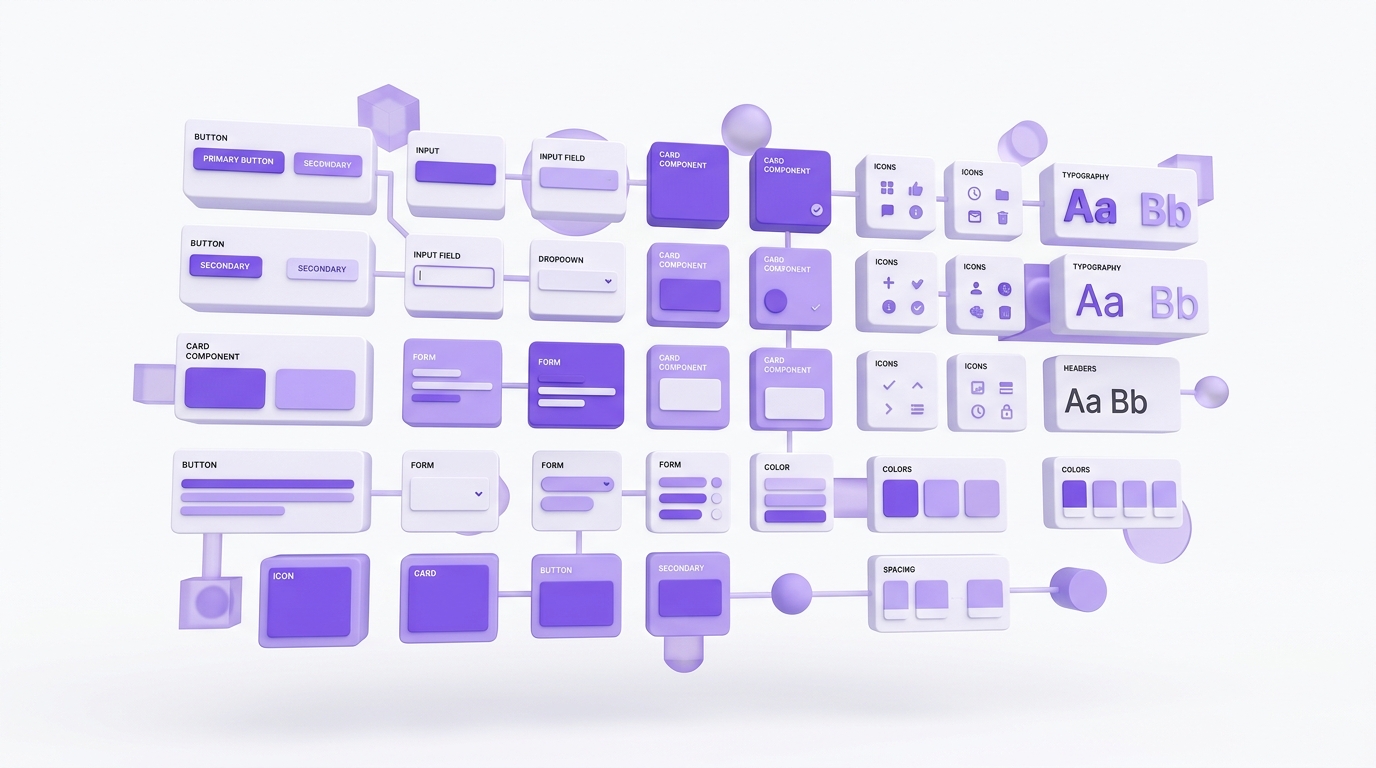
Figma component libraries and design tokens that make your product design consistent, scalable, and fast to iterate.

Figma component library (atoms to complex patterns)Design tokens for typography, color, spacingUsage guidelines and do/don't documentationStorybook integration for engineering teamsVersioning and maintenance protocols
Chat on WhatsAppFree Consultation

Design Systems That Pay for Themselves Within Six Months

Every growing US product team eventually hits the same wall: design inconsistency slows engineering, increases QA burden, and creates a long tail of subtle UX bugs that compound over time. A well-built design system replaces that friction with a shared vocabulary, a single source of truth, and a workflow where design and engineering can move twice as fast — without sacrificing consistency or quality.

What We Build

  1. Design tokens. Color, typography, spacing, elevation, and motion variables defined once and applied everywhere. Tokens are exported in formats consumable by your codebase (CSS variables, Tailwind config, Figma variables, Style Dictionary).
  2. Component library in Figma. Atoms (buttons, inputs, icons) through complex patterns (data tables, navigation, modals, dashboards) — fully documented, variant-rich, and built with auto-layout for responsive flexibility.
  3. Usage guidelines. When to use each component, when not to use it, accessibility considerations, content rules, and do/don't examples. Documentation lives alongside the components in Figma so designers find it when they need it.
  4. Storybook integration. We pair the Figma library with a Storybook implementation that engineering can browse, copy from, and use to validate that built components match designed components.
  5. Versioning and governance. A clear process for proposing new components, deprecating old ones, and rolling out updates across product surfaces without breaking changes.

What You Get

A production-ready Figma library, exported design tokens in the formats your stack needs, complete usage documentation, Storybook scaffolding, and a 90-day rollout plan to migrate existing product surfaces to the new system. Plus training sessions for your design and engineering teams so the system actually gets adopted.

When to Invest in a Design System

When you have 3+ designers, when product complexity has reached the point where designers are recreating components from scratch, when engineering is reporting inconsistency between similar UI patterns, or when you're planning a major product expansion. We've seen design systems pay for themselves within six months through reduced design rework, faster engineering velocity, and lower QA burden.
Related Articles

More Services

UX Research & User TestingProduct UX & UI DesignConversion Rate Optimization (CRO)UX Audit & Expert ReviewUX Strategy & Product Discovery

Let's build something great together — get in touch

Ready to Get Started with Design Systems & Component Libraries?

Start Your SaaS Journey