The Challenge
What Quick Was Facing
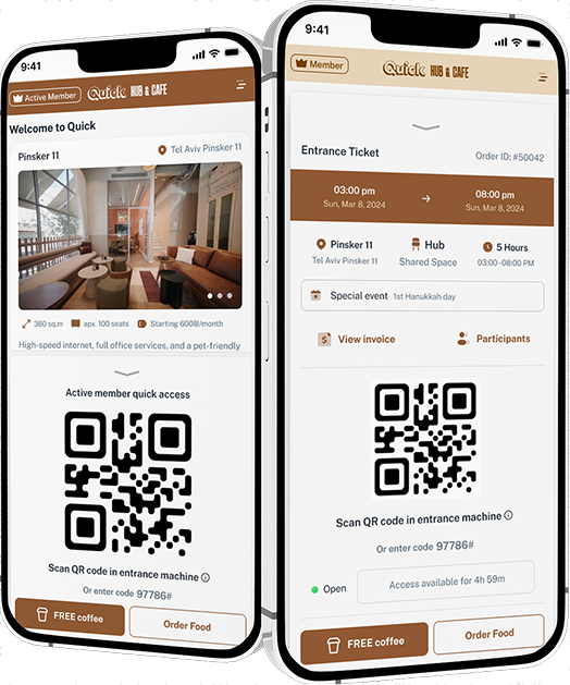
Quick's mobile checkout was hemorrhaging revenue at the payment step. Over half of users who reached checkout abandoned before completing — deterred by a multi-page payment flow, unclear error messaging, and a lack of trust signals at the moment of financial commitment. Mobile conversion was running 60% lower than desktop.
The Solution
What We Built
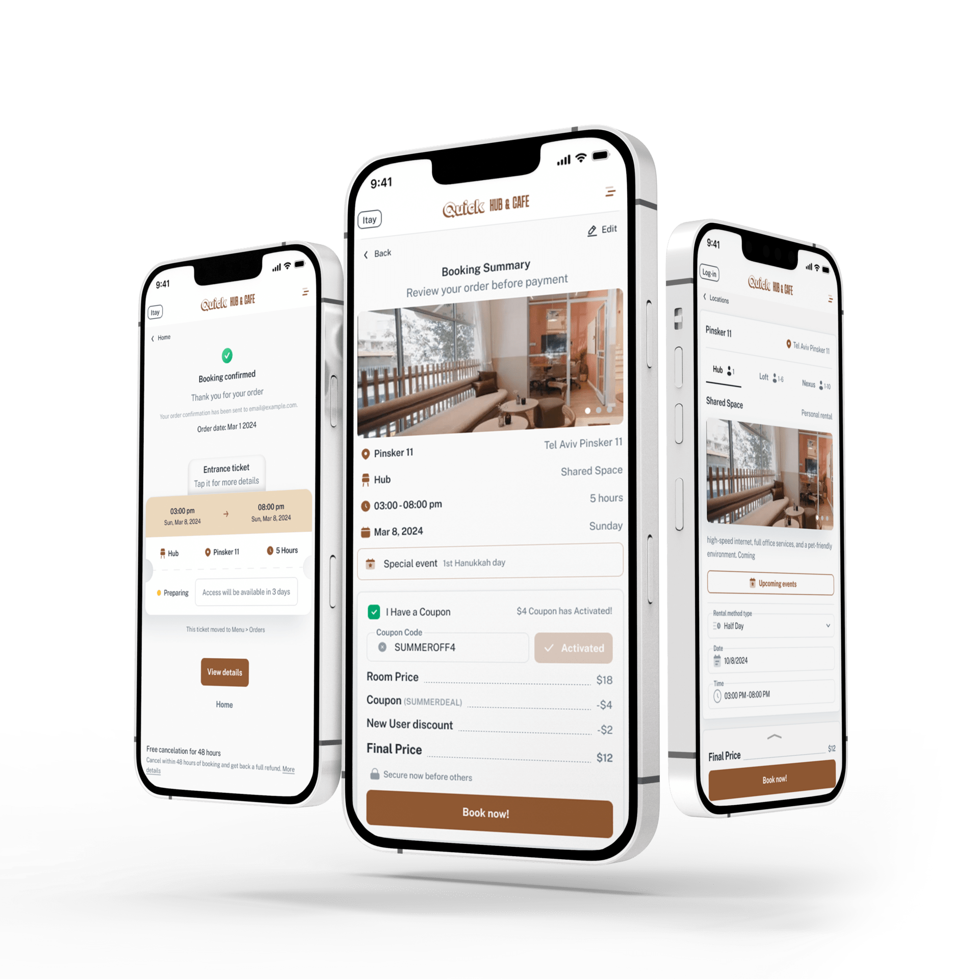
We redesigned the mobile checkout as a single-screen experience with inline validation, Apple Pay and Google Pay as primary options, and a persistent order summary visible throughout. Error messages were rewritten to guide rather than block, and trust badges were repositioned immediately above the payment CTA. The flow collapsed from four screens to one.
Results
Measurable Outcomes
✓52% reduction in checkout abandonment on mobile
✓Mobile-to-desktop conversion gap closed from 60% to 18%
✓Monthly mobile revenue increased $410K within 60 days